In what ways does the visual communication/message of the piece meet the needs of the brief?
My visual communication meets the needs of the brief firstly by being a web based portfolio successfully showcasing my design work. I have designed it on Adobe Muse and have an easy process of how images can be added to my build in slideshows and galleries. I have also have considered choices about what work is presented, not only in a design sense but also thinking about being a socially conscious designer. I have thought about all potential audiences that I’m targeting and could reach. I have been decisive in what work is shown as well as making important changes to the layout and functionality of my website.
In what ways does the visual communication/message of the piece fail to meet the needs of the brief?
I would of liked to looked more deeply into semiotics in website design as I haven’t covered a great deal about it and the role they play in website design. I have thought about colour theory and the semiotics behind that, but I want to look into typography in contrast with design layouts and imagery used.
What are the strengths of the visual communication? Why?
The strength of my visual communication lies within the layout and deign of my website. I chose to battle with a parallax website layout that proved to be very challenging at first using Muse, however with persistent attempts I finally produced something I was happy with. I feel this layout is engaging for my target audience and works well as a design portfolio.
What are the weaknesses of the visual communication? Why?
The weaknesses I feel is in my typography. As this was my first time using Muse software I was unaware of certain web fonts that you could use, and I didn’t understand at first why my typography was turning blurry and pixelated. The class also had a problem with blurry imagery that wasn’t resolved which I feel lets down my visual communication but I understand this will be noticed in marking.
In what practical ways could the piece be developed or improved?
If I spent some more time investigating some downloadable widgets I could have include more engaging items in the website, such as a built in Instagram page so users wouldn’t have to be directed to another page. Small things such as looking into web based fonts that worked with Muse could of also developed my site.
Reflections:
How was my time keeping?
My time keeping was good in the early stages of this project, however progressing through it I didn’t get on too well with the Muse software and abandoned it for the online Wix service, but after creating a website on there I didn’t feel challenged enough and wanted to push myself to learn Muse for this project and future work. I’m glad I done this however I was running short of time after learning to use Muse and develop my final site. I feel it has balanced itself out now with a web based portfolio I’m happy with.
How did I use research to generate and develop ideas?
My research was vital for me to generate ideas as I needed to see what techniques designers were using on their own web based portfolios, and other websites in general discovering things like splash screens and animated imagery. I used a lot of sketching to help brainstorm ideas which I found really helpful in my design stage.
How did I use evaluations to help with my ideas generation and development?
I evaluated my work throughout the process which resulted in several changes to the main layout of the site. This is why evaluations are so important as you can develop and improve your existing work by taking a step back, looking at what you’ve produced and seeing what’s good and what’s bad about it.
How did I use experimentation during the project? How can I make this more effective?
Most of my experimentation came from sketches, and then experimenting with digital processes on Muse and Wix to develop my site. I would of liked to make this more effective by doing more experiential work before designing, such as collaging to give myself some more ideas on layouts, semiotics and colour schemes for the site.
In what ways did I show that I had achieved the Learning Outcomes? How can I improve this next time?
‘Begun to understand computer applications and their creative use.’ – I showed I have achieved many of the learningg outcomes through my blog, but especially understanding computer applications and their creative use as I have learnt key skills from Muse that will be transferable to many other projects, I have also used Wix online service and can see how that can be used to create creative outcomes especially with animated text and imagery.
What parts of the project did I enjoy most? Why was this the case?
I enjoyed researching the most in this project as I discovered some amazing websites that have been designed, and I can only begin to image the skills needed to create some of them especially with animated parallax sites that move with the user. Researching into these sites made me think about possible job opportunities as this was something I enjoyed doing overall.
What parts of the project did I enjoy least? Why was this the case?
The beginning stages of using Muse was my least favourite as I found it really difficult to use. I had a lot of frustrating moments with it but I eventually managed to create my portfolio using its tools.
How can I go about developing and improving the parts I found difficult?
The only thing I can suggest to myself is practice, practice and practice as this is the only way I will be able to develop my skills using this software.
Overall this was an enjoyable project and I’m pleased to have learnt the basics of a new software with new transferable skills. I’m happy with my final outcome and I believe it is fitting and works well for target audience.


 Here is my gallery, it features mostly automotive photography that I am mainly interesting in, along with a few other shots from my travels. This gallery auto plays upon opening and I have included thumbnails to the right of the gallery to show the other photos.
 The next page in my parallax site is contact information. Muse offers a contact sheet widget that is simple and easy to use and edit. I used the simple contact sheet in my site that asks for a name, email and optional company, along with their desired message. This only needed to be simple as if there was more boxes to fill out it would lengthen the process and potentially annoy the user and not get the message to me.
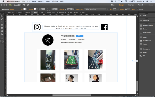 I decided to create .png icons of the two logos. I done this as I wanted the transparent background a .png file provides, this was also needed for me to create a rollover wit
 h.
h.


